Choosing paint colors is one of the most impactful and anxiety-inducing decisions in any home renovation. Color affects how spaces feel, how large or small rooms appear, and the overall mood of your home. Get it right and your rooms feel cohesive, welcoming, and perfectly suited to your style. Get it wrong and you’re living with colors that make you uncomfortable every time you walk into a room. For Pittsburgh homeowners renovating their homes, paint color selection involves balancing personal preferences with practical considerations like natural light, existing elements, and how colors work throughout connected spaces. At JL Home Builders, we guide homeowners through the color selection process regularly and understand how to approach this decision strategically rather than feeling overwhelmed by endless options.
Understanding How Light Affects Color
Pittsburgh’s climate and geography significantly impact how colors appear in your home. Our latitude means we receive less intense natural light than southern regions, and our frequently cloudy weather creates diffused rather than bright direct sunlight. These conditions affect how paint colors look on your walls. Colors that appear vibrant and saturated in brightly lit showrooms or on paint chips can look darker and muddier in typical Pittsburgh homes with limited natural light.
North-facing rooms receive the least natural light and tend to make colors appear cooler and flatter. Blues and greens can feel cold in north-facing spaces, while warm colors help counteract the cool light. South-facing rooms get the most consistent natural light throughout the day, making them forgiving for most color choices. East-facing rooms receive bright morning light that shifts to cooler indirect light in afternoon and evening. West-facing rooms have the opposite pattern with softer morning light and bright warm afternoon sun.
Artificial lighting also dramatically affects color appearance. Warm incandescent or warm LED bulbs enhance warm paint colors but can make cool colors look muddy or gray. Cool daylight bulbs make cool colors appear truer but can make warm colors look washed out or pink. Test paint colors under both natural and artificial light at different times of day before committing to ensure you like how they appear in all lighting conditions.
Starting with Inspiration and Existing Elements
Rather than staring at hundreds of paint chips hoping inspiration strikes, start with elements you already know you love. Look at furniture, rugs, artwork, or fabrics you’re keeping and pull colors from these items. This approach ensures your paint colors coordinate with existing elements and creates natural cohesion. If you have wood flooring, cabinetry, or built-in features, consider their undertones when selecting wall colors. Warm wood tones pair naturally with warm paint colors, while cool gray wood looks better with cooler paint palettes.
Inspiration can come from anywhere. Save images of rooms you love and identify what appeals to you about the colors. Is it the overall tone, the contrast between colors, or specific shades? Understanding what draws you to certain color schemes helps translate that appeal to your own space. Consider your personal style too. Traditional decor often features richer, deeper colors, while contemporary spaces tend toward neutrals with bold accent colors. Transitional styles blend these approaches with soft neutrals as a base and moderate color intensity.
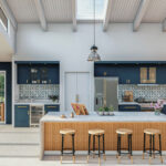
Don’t forget Pittsburgh’s architectural context. Historic homes with period details often look best with colors appropriate to their era and style. Victorian homes can carry deeper, richer colors that would overwhelm modern spaces. Craftsman homes suit earthy, natural tones. Mid-century modern homes look great with both neutrals and bold accent colors. While you’re not bound by historical accuracy, considering your home’s architectural character helps guide appropriate color choices.
Working with Neutrals as a Foundation
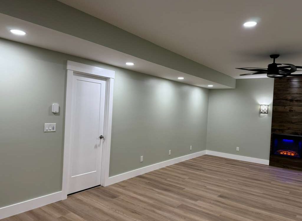
Neutral colors provide versatility, longevity, and broad appeal, making them popular choices for main living areas. Neutrals include whites, grays, beiges, taupes, and greiges that work as backgrounds for furniture, artwork, and accessories. The benefit of neutrals is they don’t compete with other elements in the room and they age well without feeling dated or trendy. Neutrals also make homes feel larger and brighter, important considerations for Pittsburgh homes that may lack abundant natural light.
However, not all neutrals are created equal. Every neutral has undertones that become apparent when applied to walls. Beige might have pink, yellow, or gray undertones. Gray can lean blue, green, or purple. White comes in countless variations from stark cool whites to creamy warm whites. These undertones interact with light, flooring, and other elements in your room, sometimes creating unexpected results. A gray that looks perfect in the store might appear purple on your walls if it has blue undertones and your room has warm lighting.
Test neutral paint colors carefully before committing. Paint large samples on different walls in the room to see how the color appears in various lighting conditions and next to different elements. Live with the samples for several days, observing them in morning, afternoon, and evening light. What looks like the perfect greige in bright afternoon sun might look dingy gray at night under artificial lighting.
Creating Flow Between Connected Spaces
In open concept homes or spaces with clear sightlines between rooms, paint colors need to work together cohesively. You don’t necessarily need to paint everything the same color, but colors should relate to each other through shared undertones or coordinating palettes. A common approach is using variations of the same color family, going lighter or darker in different spaces while maintaining the same undertone.
Another strategy involves selecting a main color for primary spaces and using accent colors in smaller rooms or areas that are more visually separated. For example, you might paint your living room, dining room, and kitchen in coordinated neutrals, then use bolder colors in bedrooms or bathrooms that are behind closed doors. This provides color variety and personality without creating jarring transitions in main living areas.
Consider the flow from room to room as you move through your home. Standing in one space, can you see into adjacent rooms? If so, those colors need to complement each other. Hallways often benefit from neutral colors that transition smoothly between rooms with different color schemes. Trim color also affects flow; consistent trim color throughout your home creates continuity even when wall colors vary.
Using Color to Solve Design Challenges
Strategic paint color choices can address various design challenges common in Pittsburgh homes. Dark rooms benefit from light colors with warm undertones that reflect available light and create brightness. Avoid cool colors in dark spaces as they emphasize the lack of light and feel cold. Small rooms appear larger when painted in light colors that blur boundaries and create airiness. Low ceilings seem higher when painted lighter than walls, especially when wall color extends slightly onto the ceiling, eliminating the hard line between wall and ceiling.
Long narrow rooms feel more proportional when end walls are painted darker colors that visually pull them forward. Large rooms can feel more intimate with deeper, richer colors that create coziness. Rooms with awkward architectural features like angled walls or unusual proportions can camouflage these issues by painting everything including the problematic elements in the same color, minimizing visual disruption.
Selecting Accent Colors and Bold Choices
While neutrals work well for main spaces, accent colors add personality and visual interest. Accent walls became popular as a way to incorporate bold color without overwhelming spaces, though this trend has somewhat fallen out of favor. If you want to try bold color, consider these approaches instead. Paint smaller rooms like powder rooms, home offices, or bedrooms in stronger colors where they create impact without dominating your entire home. Use bold colors in spaces with abundant natural light where they’ll appear vibrant rather than dark or heavy.
Incorporate color through painted cabinetry, built-ins, or furniture rather than walls for flexibility to change colors more easily than repainting entire rooms. Consider your comfort level with color too. If you love bold hues, embrace them confidently. If you prefer subtlety, stick with soft colors and bring in bolder shades through accessories and furnishings. There’s no right or wrong answer, only what feels comfortable and appealing to you.
When selecting accent colors, consider color relationships. Complementary colors (opposite on the color wheel) create vibrant contrast. Analogous colors (next to each other on the color wheel) feel harmonious and coordinated. Monochromatic schemes use different shades and tints of the same color for subtle sophistication. Understanding these relationships helps you choose accent colors that work with your base palette rather than clashing.
The Importance of Paint Quality and Finish
Paint quality significantly affects the final result. Premium paints provide better coverage, truer color, improved durability, and easier application than budget options. While they cost more per gallon, better paint often requires fewer coats and lasts longer, making the actual cost difference smaller than it appears. Pittsburgh’s humidity and temperature fluctuations demand durable paint that resists mildew, withstands scrubbing, and maintains color over time.
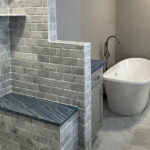
Paint finish affects both appearance and practicality. Flat or matte finishes hide wall imperfections but mark easily and are difficult to clean. They work well for ceilings and low-traffic areas. Eggshell provides slight sheen with better durability than flat, suitable for living rooms, dining rooms, and bedrooms. Satin finish offers good durability and washability for hallways, kids’ rooms, and moderate-traffic areas. Semi-gloss works well for trim, doors, and cabinets with high durability and moisture resistance. High-gloss creates dramatic sheen for doors, trim, and furniture but shows every imperfection.
Match finish to location and use. Bathrooms and kitchens need durable, moisture-resistant finishes that clean easily. High-traffic areas like hallways benefit from finishes that withstand scuffs and cleaning. Formal spaces can use lower-sheen finishes that create sophisticated matte appearances.
Testing Before Committing
Never select paint colors based solely on small paint chips or online images. Colors look completely different in large quantities on walls than they do on tiny samples. Always test colors in your actual space before painting entire rooms. Purchase sample sizes of your top color choices and paint large swatches on walls in the room you’re painting. Paint multiple walls if possible since color can appear different on walls receiving different light.
Live with samples for at least several days, observing how they look at different times of day and under various lighting conditions. Consider how the color makes you feel when you enter the room. Does it create the mood you want? Does it make the space feel the right size? Does it coordinate with your furniture and other elements? Be patient with this process even though it’s tempting to rush into a decision. Taking time to test properly prevents expensive do-overs when you realize the color doesn’t work after painting entire rooms.
Working with Professionals
If color selection feels overwhelming, consider working with a color consultant or interior designer. These professionals understand color theory, undertones, how colors interact with light, and which colors suit different architectural styles and design aesthetics. They can quickly narrow options to a curated palette that works for your specific situation, saving you time and stress while ensuring cohesive results.
Many paint stores offer color consultation services, sometimes complimentary with paint purchase. These consultants can guide you through selection and help identify undertones and complementary colors. Even if you’re confident in your choices, getting professional input can validate your decisions or catch potential issues before you commit.
Planning a paint refresh for your Pittsburgh home renovation? JL Home Builders works with homeowners to select colors that enhance their spaces and coordinate with overall design plans. Our team understands how to approach color selection strategically and can guide you toward choices that you’ll love for years to come. Contact us today for a consultation and let’s discuss your renovation plans and color vision.